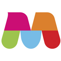
A lot of Montrealers are quite displeased with the city’s new international logo. For those who don’t know what I’m talking about, the Montreal Metropolitan Community decided to come up with a new image to brand itself on the international scene. Here’s the beauty in a nutshell:

The logo’s cost? 487,000$ CDN. An additional 200,000$ will be spent to market the thing. There are so many things that are wrong here besides how the logo looks, but I don’t know where to begin. Half a million dollars are being spent on a graphic… did anyone recently take a look at the market we are currently living in?
The Gazette (newspaper) had some humorous comments today. One I will remember the most is some guy saying we can get 2/3 of our money back by selling the logo to Winnipeg and Edmonton by flipping the image around (a W and an E). Classic.
In all honesty, the stylized M looks nice, but the colours really throw it off. If we were to stick to 2 colours (ones that weren’t quite fruity) the logo would definitely look a lot better. See an example with blue:

See? An improvement already. I’ll be sending my bill to the city shortly for collection.